The ten successful company rebranding examples include Apple’s “Think Different” campaign and Starbucks, Airbnb, and Instagram’s logo updates. Rebranding involves more than just a new logo; it can rekindle consumer interest and have a positive financial impact.

Top 10 Most Successful Company Rebranding Examples
Keeping your brand fresh and relevant today is a bit like trying to catch a greased pig at a county fair – those brands can be slippery little (fill in the blank). Your company must adapt, pivot, and sometimes do a complete 180 to stay in the game. Enter rebranding: the ultimate makeover that can turn a corporate wallflower into the belle of the ball.
Below is an outline of ten of the most successful company rebranding examples and the efforts undertaken. These companies hit the refresh button and emerged shinier, brighter, and ready to conquer the world. I picked these examples based on their creativity, market impact, financial boost, and the all-important cool factor.
1. Apple: From Core to Cutting Edge
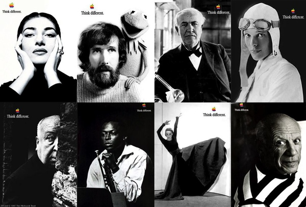
When Steve Jobs returned to Apple in the late ’90s, the company was on life support. He didn’t take the approach of just slapping a fresh coat of paint on an old barn; he tore it down and built a spaceship. Gone were the clunky product names and confusing brand architecture. In came the sleek iMacs in colors that would make a box of crayons jealous. Apple’s new minimalist logo and the “Think Different” campaign didn’t just sell products; they sold a lifestyle. It went beyond working to become a classic in branding lore. Apple went from being the kid no one wanted to sit with at lunch to the prom king of the tech world.
Jobs’ vision extended beyond mere aesthetics. The “Think Different” campaign, masterminded by TBWA/Chiat/Day, was a bold move that featured black-and-white images of historical icons like Albert Einstein, Bob Dylan, and Mahatma Gandhi, underscoring Apple’s alignment with creativity and innovation. The slogan itself was a direct challenge to IBM’s “Think” campaign, positioning Apple as the rebellious alternative in the tech industry.
The introduction of the iMac in 1998 marked a significant departure from traditional computer designs. With its all-in-one structure and vibrant colors, the iMac was not only a technological innovation but also a cultural statement. This product launch signaled the beginning of a series of groundbreaking products that would follow, including the iPod, iPhone, and iPad, each reinforcing Apple’s reputation for cutting-edge design and functionality.
The “Think Different” campaign was more than just advertising; it was a reflection of Apple’s ethos. By celebrating the “crazy ones” who push the boundaries of creativity and innovation, Apple tapped into a deep-seated desire among consumers to be part of something greater than just a brand—it was about belonging to a movement. This alignment with visionary thinkers and doers helped Apple build a loyal customer base that saw its products as tools for unlocking potential and achieving greatness.
Jobs’ return to Apple and the subsequent rebranding were not merely about reviving a struggling company. It was a transformative period that redefined Apple’s identity, making it synonymous with innovation, creativity, and excellence. The “Think Different” campaign and the introduction of aesthetically revolutionary products like the iMac were key elements in this remarkable turnaround, setting the stage for Apple to become a global leader in technology and design.
2. Starbucks: More Than Just Coffee

In 2011, Starbucks faced more competition than a dog in a park full of squirrels. Their solution? Ditch the “Coffee” in their logo and go all-in on creating an experience. Stores were redesigned to be cozy, welcoming havens where you could sip your latte and pretend you were writing the next great American novel. They expanded their menu to include everything from tea to wine, making Starbucks the go-to spot for every mood. The result? Sales skyrocketed, brand loyalty surged, and Starbucks became more than a coffee shop – it became a lifestyle.
Starbucks’ rebranding in 2011 was a strategic move to shift its identity from a coffee-centric company to a broader lifestyle brand. By removing the word “Coffee” from their logo, they emphasized the iconic siren, allowing the brand to expand its offerings beyond your morning java. This logo redesign reflected Starbucks’ ambition to be recognized globally for more than its coffee, encompassing a wider range of products and experiences.

The new logo, introduced as part of their 40th-anniversary celebration, was designed to be more versatile, particularly in digital and mobile contexts. The streamlined design also aligned with modern minimalist trends, ensuring the brand’s visual appeal remained contemporary and relevant. This rebranding coincided with the launch of new products, such as the Starbucks Tribute Blend™ and various food items like Cake Pops and Mini Cupcakes, which helped attract a broader customer base.
Additionally, the redesign of Starbucks stores aimed to create a welcoming environment that encouraged customers to linger, enhancing the overall experience. This approach transformed Starbucks locations into community hubs where people could gather, work, and relax, thus reinforcing the brand’s image as a lifestyle choice rather than just a place to grab a coffee.
Rebranding Outcomes:
Overall, the 2011 rebrand was a bold and successful move that allowed Starbucks to diversify its product offerings and strengthen its global presence, ultimately leading to increased customer loyalty and significant growth in sales.
McDonald’s rebranding is like the ultimate glow-up. They’ve gone from being the poster child for fast food excess to a brand that even your health-conscious friend can’t complain about. By introducing salads, wraps, and sourcing better ingredients, they’ve managed to keep everyone happy. Throw in the modernized restaurants with digital menus and self-service kiosks, and McDonald’s is looking pretty slick. They’ve maintained their market dominance and even managed to appeal to the quinoa and kale crowd.
The McDonald’s rebranding strategy has been multi-faceted, focusing on both menu enhancements and restaurant design. In recent years, McDonald’s has committed to offering healthier options and improving ingredient quality. For instance, they’ve added salads and wraps to their menu, and made significant changes to their Happy Meals, including more balanced choices such as fruit, low-fat dairy, and water.
Moreover, McDonald’s has made substantial investments in modernizing its restaurant interiors to create a more inviting and upscale atmosphere. This includes the use of neutral-toned materials, mood lighting, and a variety of seating options to accommodate different customer preferences. The addition of digital menus and self-service kiosks has not only streamlined the ordering process but also enhanced the overall customer experience.
These changes have not only improved the public perception of McDonald’s but have also had a positive impact on their business performance. After implementing these updates, McDonald’s saw a notable increase in sales and customer satisfaction. Their efforts to promote a healthier, more contemporary image have allowed them to maintain their market dominance while appealing to a broader, health-conscious audience.
Rebranding Outcomes:
Ultimately, McDonald’s rebranding efforts have effectively transformed its image from a symbol of fast food excess to a modern, health-conscious brand. By updating their menu and modernizing their restaurants, they’ve successfully attracted a new demographic without alienating their traditional customer base.
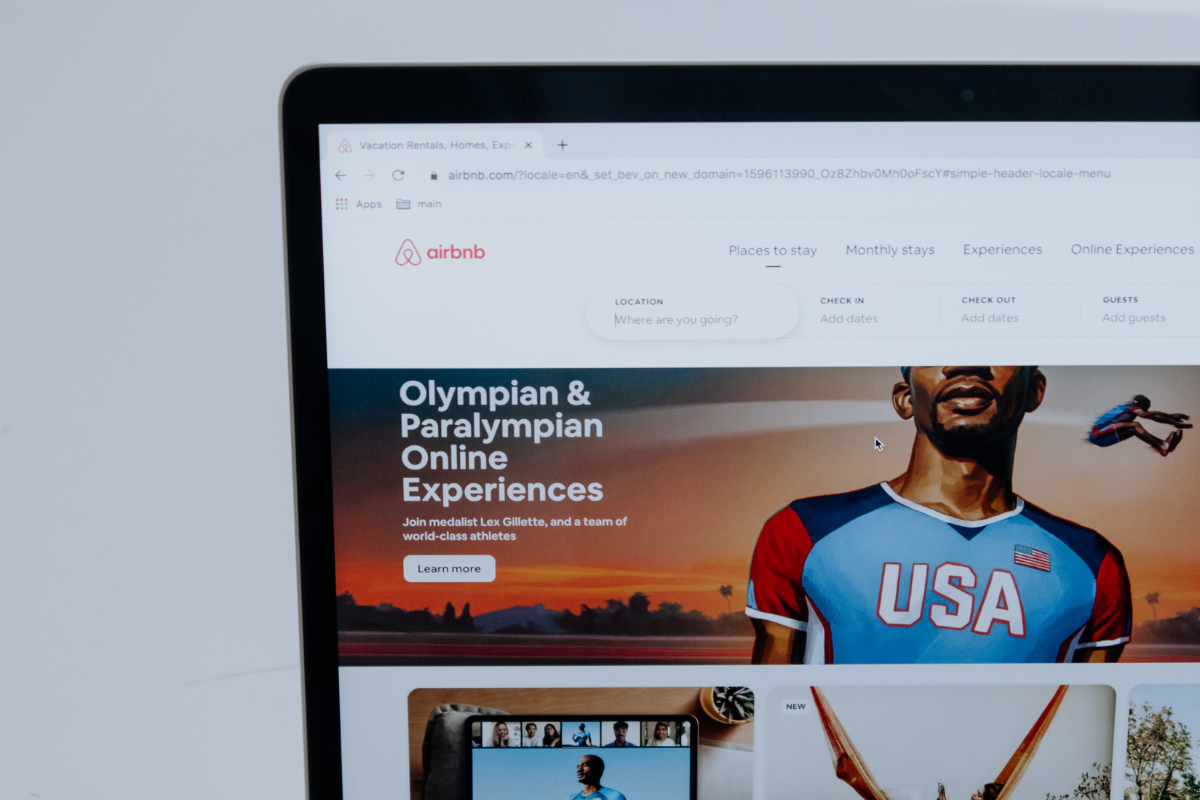
3. Airbnb: Belong Anywhere
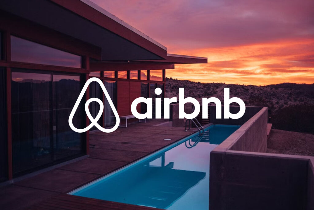
Airbnb’s 2014 rebranding was like a breath of fresh air in a musty old room. They introduced the “Bélo” logo – a heart, a location pin, and the letter A all rolled into one. This wasn’t just a logo; it was a symbol of belonging and inclusivity. Their visual overhaul extended to every part of the brand, creating a unified look that said, “Come stay with us, no matter who you are.” The rebranding helped solidify Airbnb as the king of the sharing economy, making it the go-to platform for unique and personal travel experiences.
The “Bélo” logo was designed to encapsulate Airbnb’s core values: people, places, love, and Airbnb itself. This simple yet profound symbol was meant to be easily recognizable and could be drawn by anyone, emphasizing the universal nature of Airbnb’s mission to foster a sense of belonging anywhere in the world.
The rebranding effort, led by DesignStudio, was comprehensive and went beyond just a new logo. It included a refreshed color palette with a new bespoke color called “Rausch,” named after the street where Airbnb was founded. This color was designed to convey passion and emotion without the aggression typically associated with pure red. The visual identity also incorporated a custom typeface and new photography and illustration guidelines, creating a cohesive and inviting brand aesthetic.
To further personalize the brand experience, Airbnb introduced the “Create Airbnb” platform, allowing hosts and users to customize the Bélo symbol for use on thank you cards, mugs, t-shirts, and other items. This initiative reinforced the idea that Airbnb’s identity was shared with its community, making each symbol unique to the individual host or guest.
The rebrand also extended to Airbnb’s digital presence. The website and mobile apps were redesigned to better reflect the brand’s new identity, featuring immersive photography, bold colors, and clearer listing information. The aim was to highlight the personal and unique travel experiences that Airbnb offers, moving away from a focus solely on accommodation listings to emphasizing the connections and memories created through travel.
Rebranding Outcomes:
Despite some initial controversy and mixed reactions to the new logo, the rebranding was ultimately a success. It not only helped boost Airbnb’s market valuation but also strengthened its position as a leader in the sharing economy by clearly communicating its commitment to community and belonging.
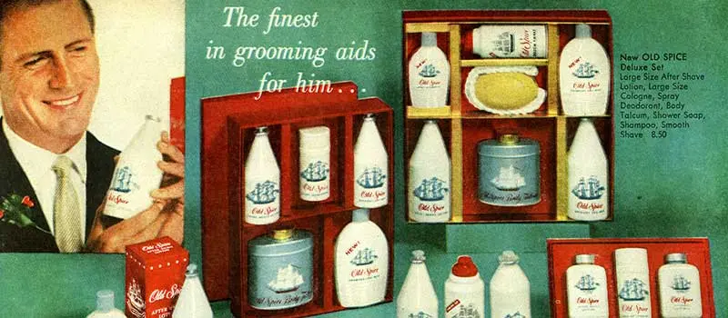
4. Old Spice: From Your Granddad’s Aftershave to Millennial Must-Have
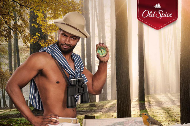
Old Spice went from your granddad’s go-to aftershave to the must-have for the millennial man. Their 2010 rebranding was pure genius. They introduced a series of hilarious ads featuring Isaiah Mustafa, aka “The Man Your Man Could Smell Like.” These commercials were not just funny; they were viral gold. The campaign was everywhere – TV, social media, you name it. The result? Old Spice became cool again, boosting sales and market share while making everyone laugh in the process.
The “The Man Your Man Could Smell Like” campaign, created by Wieden+Kennedy, was a game-changer for Old Spice. The campaign’s aim was to refresh the brand’s image, which had become outdated and associated primarily with older generations. The creative team at Wieden+Kennedy developed a humorous and visually striking series of ads that featured Mustafa delivering rapid-fire monologues in increasingly absurd and fantastical settings.
These commercials debuted online and quickly went viral, thanks to their witty script and Mustafa’s charismatic performance. The initial ad was followed by a series of personalized response videos where Mustafa addressed comments and questions from fans on social media, further engaging the audience and cementing the campaign’s popularity.
Rebranding Outcomes:
The impact of the rebranding was profound. Within months, Old Spice’s sales had surged dramatically, with some products seeing up to a 125% increase in sales. The campaign also won numerous awards, including the Grand Prix at the Cannes Lions International Advertising Festival and an Emmy for Outstanding Commercial.
By leveraging humor and the viral nature of social media, Old Spice successfully transformed its brand image, making it appealing to a younger, more modern audience. The rebranding not only revitalized Old Spice’s market presence but also set a new standard for how traditional brands could reinvent themselves in the digital age.
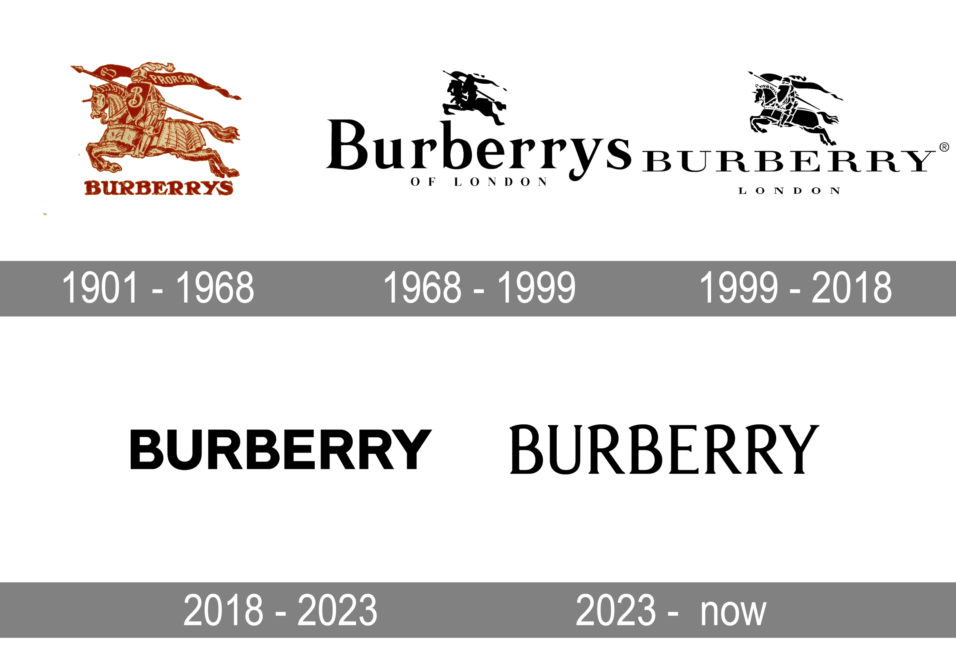
5. Burberry: Back to Luxury

Burberry’s rebranding journey is a tale of redemption. In the late ’90s and early 2000s, their iconic check pattern was as common as knock-off handbags on Canal Street. To regain their luxury status, Burberry stripped down to the essentials. They focused on high-quality, timeless pieces and leveraged digital innovation to engage a younger audience. Their rebranding, led by Angela Ahrendts and Christopher Bailey, turned Burberry back into a symbol of British elegance and style, driving growth and profitability.
Angela Ahrendts, who became CEO in 2006, and Christopher Bailey, who served as Chief Creative Officer, spearheaded this transformation. One of their first steps was to reclaim control over Burberry’s intellectual property and reduce the over-licensing of their iconic check pattern, which had diluted the brand’s exclusivity. They limited the use of the check pattern to less than 10% of Burberry’s products, re-establishing it as a mark of luxury.
Ahrendts and Bailey also embraced digital innovation at a time when many luxury brands were hesitant. They launched social media campaigns, livestreamed fashion shows, and revamped Burberry’s e-commerce platform. This digital strategy helped Burberry connect with a younger, tech-savvy audience and positioned the brand as a leader in digital luxury retail.
Their efforts extended to the physical retail space as well. The Burberry flagship store on Regent Street in London was redesigned to mirror the online experience, creating a seamless integration between the digital and physical shopping experiences. This approach not only modernized the brand’s image but also enhanced customer engagement and loyalty.
Under Ahrendts and Bailey’s leadership, Burberry also highlighted its British heritage through campaigns featuring British actors, musicians, and models, such as Eddie Redmayne and Cara Delevingne. This reinforced the brand’s roots while presenting a modern, aspirational image.
Rebranding Outcomes:
The results of these efforts were significant. Burberry’s revenue and market share grew, and the brand regained its status as a symbol of British elegance and innovation. The strategic focus on digital transformation and careful brand management turned Burberry into a luxury powerhouse, admired not only for its products but also for its forward-thinking approach to brand building.
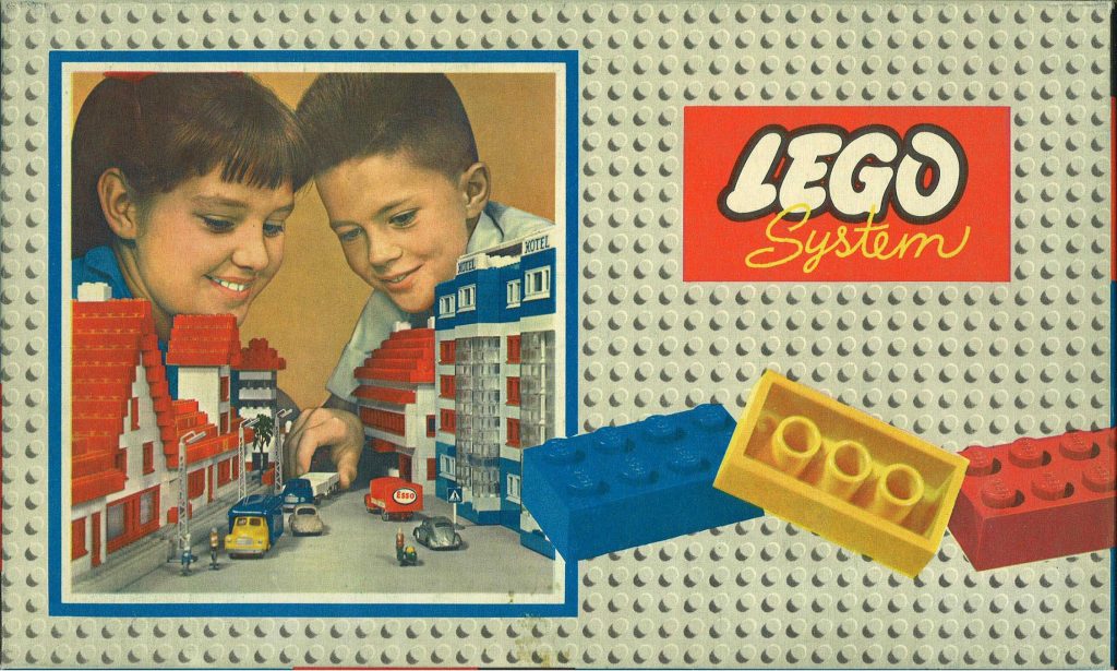
6. LEGO: Building a Brighter Future

In the early 2000s, LEGO was in trouble – think stepping on a LEGO brick with bare feet kind of trouble. To turn things around, they refocused on their core building sets and embraced the digital age. They launched video games, apps, and even movies, making LEGO not just a toy, but a multimedia empire. Their rebrand emphasized creativity and imagination, appealing to both kids and adults. The turnaround was so successful, LEGO went from nearly bankrupt to one of the most powerful brands in the world.
LEGO’s strategy was multifaceted and involved several key initiatives:
Refocus on Core Products:
Jørgen Vig Knudstorp, appointed as CEO in 2004, refocused LEGO on its core product – the interlocking brick system. He streamlined product lines, cutting those that didn’t fit the “system of play” concept and focusing on the versatile and reusable bricks that made LEGO famous. This strategy reduced production costs and revitalized the brand’s core identity.
Embrace Digital Transformation:
LEGO recognized the need to appeal to the digital generation. They developed video games like “LEGO Star Wars” and “LEGO Batman,” which introduced new audiences to LEGO through interactive gameplay. Additionally, LEGO brought in digital design tools, such as LEGO Digital Designer, allowing users to create virtual models before building them physically.
Engage the Community:
LEGO actively engaged its fan community through platforms like LEGO Ideas, where enthusiasts could submit their own designs for potential production. This crowdsourcing initiative not only generated innovative new products but also fostered a strong sense of community and co-creation among LEGO fans.
Leverage Popular Franchises:
Partnering with popular franchises like Star Wars, Harry Potter, and Marvel, LEGO created themed sets that attracted fans of these series. These partnerships expanded LEGO’s appeal beyond traditional audiences and significantly boosted sales.
Innovative Marketing and Storytelling:
LEGO’s brand refresh successful ventures into multimedia, with movies like “The LEGO Movie” achieving blockbuster status. These films were not only entertaining but also served as powerful marketing tools that reinforced LEGO’s brand story of creativity and fun.
Through these strategies, LEGO successfully navigated its financial crisis and emerged as a leading global brand. Their emphasis on innovation, community engagement, and strategic partnerships transformed LEGO from a struggling toy company into a multimedia cultural phenomenon.
7. Google: The Alphabet Soup
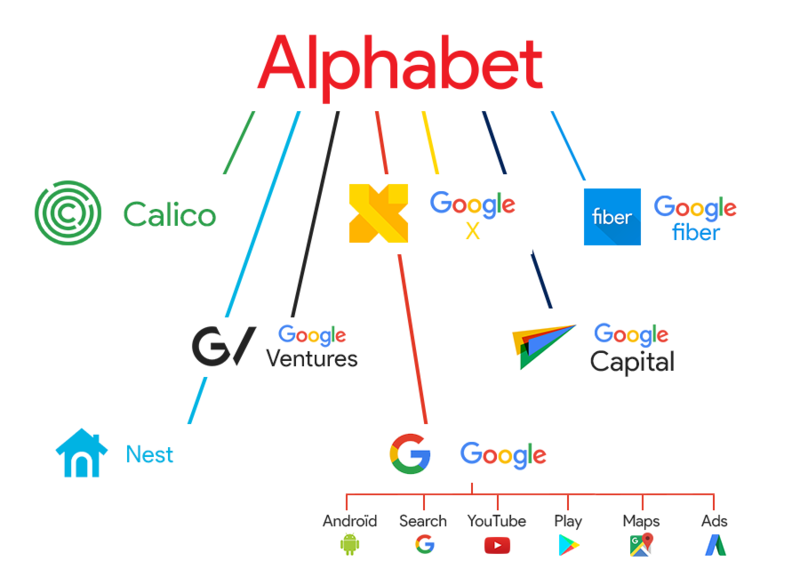
Google’s 2015 major rebranding to Alphabet was like reorganizing a junk drawer. By creating Alphabet as a holding company, they separated the core search business from their more experimental ventures like self-driving cars and life sciences. This move provided clarity and focus, allowing each arm to innovate and grow without stepping on the other’s toes. It might have been confusing at first, but the rebranding allowed Google to maintain its dominant position while still playing in the big leagues of tech innovation.
The decision to form Alphabet was driven by the need to streamline operations and provide better transparency to investors. Before the rebrand, Google’s various ambitious projects—collectively referred to as “moonshots”—were managed under the same umbrella, causing concerns about financial clarity and accountability. By establishing Alphabet, Google could clearly delineate its highly profitable core businesses (like search and advertising) from its riskier, more innovative ventures.
Larry Page, one of Google’s co-founders, explained that the new structure would help the company focus on longer-term projects and improve oversight and management of its diverse business interests. The move also aimed to mitigate potential antitrust issues by clearly separating the core search business from other ventures, thus reducing the regulatory scrutiny on Google’s operations.

Alphabet includes a variety of subsidiaries beyond Google, such as Waymo (self-driving cars), Verily (life sciences), and Calico (biotechnology focused on aging). This reorganization allowed each subsidiary to pursue its specific goals and innovations independently, fostering a more focused and efficient operational environment.
The rebranding to Alphabet also represented a strategic move to ensure that Google’s experimental projects did not distract from its core business. It provided a framework where new ideas could be developed without the pressure of directly impacting the financial performance of Google’s primary revenue streams. This separation allowed for greater innovation and growth within each segment, ultimately contributing to Alphabet’s overall success as a leading tech conglomerate.
Rebranding Outcomes:
Overall, Google’s transformation into Alphabet was a bold and strategic move that provided operational clarity, enhanced financial transparency, and fostered innovation across its diverse business units. This restructuring helped maintain Google’s dominance in its core areas while enabling new ventures to thrive independently.
8. Dunkin’: Dropping the Donuts
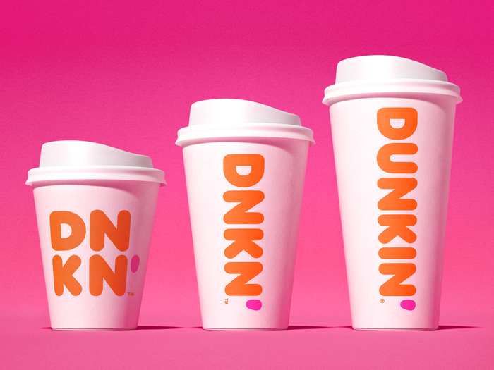
In 2018, Dunkin’ Donuts decided it was time to shed some weight – specifically, the “Donuts” from its name. The rebranding to just “Dunkin'” was more than a name change; it was a strategic pivot to focus on coffee and beverages, which had become a huge part of their business. The updated logo, refreshed store designs, and a snazzy mobile app helped attract a younger crowd and positioned Dunkin’ as a versatile, on-the-go brand. The result? A successful rebranding that’s kept the coffee and donut lovers coming back for more.
The motivation behind this shift in name and visual identity was to better reflect the company’s evolving product offerings and to emphasize their beverage-led strategy. Dunkin’ recognized that beverages, especially coffee, were driving a significant portion of their sales growth. By dropping “Donuts” from the name, they aimed to communicate this shift more clearly to consumers and investors alike. Dunkin’ The Brand Hopper
Key Elements of the Rebranding:
Name and Logo Change:
The rebranding included a simplified name and logo, retaining the familiar pink and orange color scheme introduced in 1973. This modernized the brand’s image while maintaining its recognizable and beloved identity.
Store Redesigns:
Dunkin’ invested in upgrading its store designs to create a more modern and efficient customer experience. This included the introduction of innovative elements like cold beverage tap systems, glass bakery cases, and dedicated mobile order pick-up areas. These changes were aimed at enhancing convenience and speed for the on-the-go consumer.
Digital Enhancements:
The rebranding also involved significant investments in digital technology, including a revamped mobile app that facilitated mobile ordering and payment. This digital focus helped Dunkin’ appeal to a tech-savvy, younger demographic.
Product Innovation:
While the rebranding highlighted beverages, Dunkin’ continued to innovate with its food offerings. They introduced new products like Donut Fries and emphasized the availability of seasonal and popular donut varieties to ensure that traditional donut lovers still felt catered to.

Rebranding Outcomes:
The rebrand was highly successful, achieving several key objectives for Dunkin’. It attracted a broader customer base, particularly younger consumers, and reinforced the brand’s position as a leader in the coffee and beverage market. The strategic focus on beverages, combined with modernized stores and a strong digital presence, allowed Dunkin’ to remain competitive in a rapidly evolving market.
In summary, Dunkin’s rebranding to emphasize its beverage offerings and streamline its brand identity has proven to be a smart move, enabling the company to grow and adapt to changing consumer preferences while maintaining its core appeal.
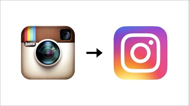
9. Instagram: From Polaroid to Pro

Instagram’s 2016 rebranding was like trading in your first car for a sleek new ride. The platform needed a visual identity that reflected its evolution from a simple photo-sharing app to a multimedia powerhouse. The new logo, with its vibrant gradient and simplified camera icon, was designed to be more flexible and modern. This rebranding came just in time for the launch of new features like Stories and live video, which boosted user engagement and kept Instagram at the forefront of the social media scene.
The rebranding process was spearheaded by Ian Spalter, Instagram’s Head of Design, who aimed to create a logo that would resonate with Instagram’s diverse user base. The new design featured a vibrant gradient background of sunset colors – orange, yellow, pink, and purple – with a minimalist white outline of a camera. This was a significant departure from the old, skeuomorphic Polaroid camera icon, signaling Instagram’s shift towards a more modern and dynamic visual identity.
Alongside the new logo, Instagram also revamped its user interface to be more intuitive and user-friendly. The app’s color scheme was simplified to black and white, allowing user-generated content to stand out more vividly. This clean design approach was intended to highlight the community’s photos and videos, making them the central focus of the app.
The timing of the rebranding was strategic, aligning with the introduction of several major new features. Instagram Stories, launched in August 2016, allowed users to share photos and videos that disappear after 24 hours, similar to Snapchat’s format. This feature quickly became popular, driving significant user engagement. Additionally, Instagram introduced live video streaming, further expanding its multimedia capabilities and offering users new ways to connect and share in real-time.
Rebranding Outcomes:
Despite initial mixed reactions to the new logo, the new brand identity ultimately proved to be successful. The new visual identity, combined with the rollout of innovative features, helped Instagram maintain its relevance and continue to grow its user base. The rebranding highlighted Instagram’s commitment to evolving with its users and staying ahead in the competitive social media landscape.
Instagram’s 2016 rebranding was a bold and necessary step that reflected the platform’s transformation and positioned it for future success. The updated logo, enhanced user interface, and new features like Stories and Instagram Live all contributed to making the app a more versatile and engaging platform.
Conclusion Company Rebranding Examples
These significant rebranding success stories show just how powerful a well-executed rebrand can be. From Apple’s design revolution to Old Spice’s viral campaigns, these companies have proven that rebranding is more than a facelift – it’s a full-on transformation. The key is understanding your core values, knowing your audience, and not being afraid to shake things up. In today’s fast-moving world, rebranding isn’t just an option; it’s a necessity. Take a cue from these trailblazers, and don’t be afraid to reinvent yourself. Your future self will thank you.